
Friday, 30 April 2010
Evaluation (4)
How Did You Use New Media Technologies In The Construction And Research, Planning And Evaluation Stages?
Throughout the whole project many media technologies and applications were used. A High Definition digital camera was both used for still images and the filming of the trailer. In the initial stages of planning the camera was used to plan the storyboard by locating scenes and shots and gathering the right lighting and angles for the final filming. To create a different grittier mood some of the video was played through a TV and filmed, this created a complex voyeuristic view through the eyes of the killer gamer. The footage was later uploaded onto the computer using a Firewire. I intended to use imovie to edit the trailer but I found there were limitations of what I could do, so I downloaded a free trial of Adobe Premier Pro. The film footage was then easier to work with, although it is a more complex system it gave me the chance to work with several different layers of video and sound. I was able to delete unwanted scenes, cut clips, add narrative and sound effects. I downloaded sound effects from Audio iStock, The simplicity of the whirring tone and base heart beat was repeated and precisely placed along side the footage for maximum impact, this was challenging with the quick cutting from one scene to another.
The production titles, magazine front cover and poster were created using Adobe Photoshop and Illustrator. The Computer font was from dafont.com PixelSplitter but then it was manipulated to fit in with the gaming theme. The final “blood” title scene was created using a photoshop colour and blur on two separate texts then merging them together in the footage in Adobe Premier Pro. Once I had finished the editing process, the teaser trailer was then converted into a Quicktime file allowing it to be uploaded onto my online blog as well as my viral campaigns: Facebook and Youtube.
The still images which were taken whilst filming the footage, were also edited in Photoshop. They were resized and stylized in order for them to correspond with the teaser. I tinted some of the shots red to add a more slasher effect. The images were then used to create the film poster, film magazine. The teaser trailer along with the poster and magazine cover were then uploaded onto our blog where external links and video footage were also used. I also decided to use www.facebook.com and www.youtube.com to create an established audience and also to gain important feedback to improve our products.
Thursday, 29 April 2010
Evaluation (3)
What have you learned from your audience feedback?
After having created our first draft to our trailer, I considered that feedback would be vital and could influence any changes to the trailer. Several different ideas were gained from discussing the draft with students and family members. From this, I aimed to get different opinions and see what negative feedback would lead me to consider any changes and what was currently working. The consensus was the lack of a voice over was successful and the simplicity of the plot was mysterious and engaging, it needed to be tied together with some sort of flag posts through out the trailer so the computer graphics where introduced to carry the viewer through.
Those who watched our finished trailer did give us good feedback and liked the use of the quick edited shots, atmospheric sound effects and use of light and imagery, as well as the theme of the Killer being a disturbed computer gamer. Those who said they would not watch the film were not horror fans however had positive feedback on the overall effect of the teaser trailer.
Wednesday, 28 April 2010
Evaluation (2)
How Effective Is The Combination Of Your Main Product And Ancillary Texts?
My Teaser trailer is targeted for a Teenage audience and has a Rating of 15. I visited websites such as www.watch-movies.net, where I analysed slasher horrors. I found that audience aged 15-24 rated some of the films more than 7 stars out of 10. As those who rated fell under our target audience category I related this to our film. This made us more aware of the amount of people that watch and enjoy slasher horrors. I did not think that our film had a secondary audience such as an older audience; this is not conclusive due to our feedback films, which featured two older men, one who would enjoy the film and one who wouldn’t!
The marketing campaign that I created was successful as I used a number of promotional tools that can easily be accessed nationally and globally by my specific teen target audience. The teaser trailer was posted on Youtube and in a Facebook group allowing audiences were allowed to join; become members of the fan group and view the trailer. Additionally it allows fans to see pictures of the poster and shots taken whilst filming of the setting and killer and view the actual trailer whilst at the same time invite other friends to do the same. The two social networking sites I used are both easily accessible and used by millions of teens across the globe. My objective for the teaser trailer was to create word of mouth via these social networking sites as this phenomenon of word-of-mouth has created much success for many films because social networking sites have never been more popular and people can talk about what they love freely and together can create a global campaign for something like a film.
The limited footage allows audiences to recognise the slasher horror genre without giving too much of the story away. I purposely didn't want to include the past story to why the killer became this way as it will encourage people to want to watch the film. This created hype around the teaser, causing audiences to discuss its content and encouraging them to find out more information online, using the public Facebook group and Youtube. This made it easier for me to gain an established audience so that when the poster and magazine was published, they were more confident to give both positive and negative feedback. Films such as ‘The Dark Night’ have successfully portrayed stunts of viral marketing as the slogan ‘Why so serious?’ became one of the best known slogan of all time and resulted in the film earning the most in box office revenues in 2008.
Posters in any film campaign are of great importance because they have to try and capture in a still image the promise of the moving images that you will see at the cinema. The poster for a film has to tell you as much information about a film as it can with one look at it, but because the poster that I created was a teaser poster, I wanted it to portray something sinister and different to what you normally encounter in everyday society whilst at the same time not revealing too much and leaving you to want to know more about what you have just seen.
Our film magazine and poster appeals to the right genre as it offers conventions the audience is expecting to be seen. The poster will appeal to the horror movie fans including our target audience as the mis-en-scene is shown through and is easily identifiable. Our target audience may also want to see the film as it relates to them due to the age of the boy killer and the virtual reality world he is emerged in. The Gaming world and paraphernalia is so easily recognized and familiar to the younger generation, the computer font instantly allows the audience to relate to the film.
The magazine as an ancillary product concentrates a lot on the killer and his personality. I took a picture of a long shot of 'Dylan' (the antagonist) in a dark and scary lift with a gate door which he closely stood by; this links back to the film as it looks like a possible prime location of where he could have committed one of his murders. The genre (slasher horror) is shown through our media products, as the images used are dark, as well as the title of the film in red signifying blood.
In terms of the title of the film, Many conventional slasher horror titles relate back to the past story of the killer and are most commonly named after an occasion. Examples of this include 'Friday the 13th', 'Halloween' and 'My Bloody Valentine'. However, “Game Over” was directly related to the nature of the virtual world the killer was obsessed with, it is a familiar tag line for most computer games when you have died or failed in a task, It also is a descriptive term for death. Although I wanted to make the genre of the film clear, I felt like I didn't have to follow conventional slasher horror titles and have anything too descriptive in the title, as in the trailer. It was important to maintain a more abstract approach to the creation of the teaser trailer keeping the nature of the film ambiguous. I made the genre of the film clear in our viral campaign and through synergy, but although the images used are suggestive of a slasher , they are also very dark and anonymous, you never see the killers face or details of the plot.
There was limited narrative and use of footage in the trailer. This was not necessarily what I initially wanted to do but it worked as when I looked into our research, I found that trailers such as Toy Story and Star Trek that thought less about providing a story, concentrated on introducing the characters and setting the mood of the feature film. I wanted to follow the way they have done this in just giving the audience an insight into the personality of the boy who becomes a disturbed killer obsessed with computer games...
Evaluation (1)
In what ways does your media product use, develop or challenge forms and conventions of real media products?
Our trailer maintained most conventions found in slasher horrors. However our trailer does not feature a voice over as in many Horror films, when I looked into existing horror trailers like Paranoid
(http://youtubevideos.me/index.php/1010110A/e69f547213b6454890c0444595aaa0bb038fa0db1023c963371bfb08097dfb86a290c0ec8c3c5aab17408)
where there is a voice over, I found that the use of the voice takes away the verisimilitude and detracts from the stark imagery. I did however put in computer graphic style text through out the trailer to keep the viewer engaged and tie in with the theme of the slasher Horror. The use of text was useful in setting the tone and indicating where the disturbed virtual reality meets reality, specifically towards the end the words “Error Connection Lost” reflects the slashers loss of connection to the real world.
I decided to keep the moment of attack or any gory details, as well as narrative out of the trailer to keep an element of mystery and to “tease the viewer. This is a conventional method of horror trailers so it gets the title out and gets people interested in the forthcoming film with out giving anything away. “Less is more” is often true, the scare factor is heightened when the threat is ambiguous. It is an effective technique for a teaser trailer like this one.
The Poster accompanying this film follows along the conventional lines of most slasher promotional material, a strong use of dark imergary along with a red filter and menacing text. This has a strong impact and is recognized as a horror film instantly.
The Magazine cover had much of the same conventions as the Poster, stark image and bold text. The Magazine title and font itself was based on other film magazines out at the moment, from Fangoria to Empire. The playful title Spooktacular is approachable but obviously relating to the horror genre. The Bold use of text and layout were arranged to fit well with the main picture.
Monday, 26 April 2010
Audience Feedback
After having created and edited the trailer, we wanted to see what our target audience actually thought of it. We randomly selected people within the local area and played them the Teaser. I came up with a series of straightforward and direct questions to gauge an immediate response to the trailer while it was fresh in their minds.
From analysing all the feedback videos, we found that 4 out of the 5 people we asked would go and watch our film... proving the trailer worked as well as we'd wanted.
Some of the main comments were:
* Professional Trailer
* Dark / Moody Atmosphere
* Gripping Theme (Disturbed Gamer)
* Kept users interested and wanting to see more
Every person was able to identify the genre of the film and its theme so a successful trailer overall and clearly hitting the right audience. The feedback regarding the style was very positive as people described the tralier as portraying conventional slasher horror to good effect. The professional edited look of the trailer was down to a well planned storyboard, shot list, sound effects and adobe premier cutting/editing software. The main selling point of the Trailer was to give off the feel of a 'disturbed gamer' who is simply taking things to the next level and judging by the feedback it seems most people understood this theme mainly due to the intro and overlay text style.
We received quite positive feedback and any negative feedback we received, we took into account and would certainly consider some suggestions and options if developing this again.
I think to improve the trailer further, that perhaps we needed a greater number of feedbacks so we could get a broader reaction and truly assess how effective the trailer really is, as so many were very positive.
-> Facebook Group <-


-> YouTube Feedback Post <-

Saturday, 24 April 2010
Friday, 23 April 2010
Questionnaire
As part of my market research, I decided to produce and hand out a questionnaire aimed at teenagers from the age of 15 and onwards, to help me work out how to make my slasher horror successful. I randomly selected 30 students of which were 15+ to answer my questionnaire.
Below is the questions and results from the questionnaire.
1.) Do you enjoy watching slasher horror films?
In order to understand the interests of my potential market, I needed to know the percentage of those who enjoy watching slasher horror films to help me generalise the answers. It was good to know that 80% of the people enjoy watching slasher horrors therefore allowing me to analysis the other results in working out what their possible opinion will be on my film.
2.) Would you prefer to see a male or female killer?
To help me in deciding whether my killer should be male or female , I decided on asking this question. Although initially, I was going to use a female killer to challenge conventions and show that a female can look as daunting. After having thought about it carefully along with taking my research into consideration, I found that this may a little more complicated. Additionally, as I was required to produce a teaser trailer, it would be a short clip, therefore I wanted my audience to have a stereotypical assumption of the film.
3.) Would you find a slasher horror film scarier if the killer was masked?
From secondary research looking into conventional slasher horror killers, I found that one thing they all have in common is the either wear a mask or dehumanise their face. I wanted to ask this question to see whether this placed great importance in whether an individual would find the film scarier. By looking at the percentages, only 40% said no while 60% said yes. I didn't want my killer to be masked as I want to emphasis the fact that he is just an ordinary person and want to show that a killer can still look as daunting and scary without a mask.
4.) Do you think a film is scarier when it is set indoors rather than outdoors?
The location in which a horror film is set can often determine whether someone finds the film as scary as if it were set somewhere else. As I have chosen to set my footage indoors, I wanted to know whether this will have an effect on the reactions of my target audience and their opinions. On this question, I found that the percentages were in fact very close with 55% of people choosing indoors as a scarier setting and 45% believing the opposite. As the percentages were very close, I didn't focus too much on whether is would make a difference, for as long as it's set in the right environment.
5.) Would the release date of a horror film encourage your decision to go and watch it?
Often the release date can have a major impact on the amount of people who go out and watch a film. For example, those who may not go to the cinema very often, may in fact choose to go and see a scary film around the Halloween period. However, when I looked at the results from this question, I found that only 25% of people feel the release date has an effect on whether they would go and watch the film. I have decided to not place great importance on the release date as such, as I believe that it won't make much of a difference. On the other hand, I do feel that people are more likely to go and watch a film in the cinema around winter time rather than summer due to the weather.
Film Magazine
As part of the marketing campaign for my slasher horror film, I was required to create a front cover for a film magazine. I looked at all the still images taken during the filming and picked out one fo the most powerful ones. I chose a shot of the killer with his weapon to emphasis the slasher horror genre following conventions. The image that I chose was a still which was taken whilst filming our teaser trailer rather than an image taken on a photo shoot to add to its authenticity.

->Layout Design / Plan<-


->First Draft<-

->Inspiration<-

I researched Fangoria magazine, as inspiration for our own magazine. I liked the use of the bold title and the dominance of the image. FANGORIA magazine is specially dedicated to the horror genre. Again, the image of a victim in SAW V dominates the entire page, a convention that was repeated throughout our research. As to stay true to the conventions within horror, I tried my best to make my image of my killer dominate of the front cover of my film magazine.
Film Poster
As part of the marketing campaign, we were asked to design a film poster to help advertise and promote our teaser trailer. I decided on an image where the killer is presented yet his identity cannot be seen to create a more sinister effect. I also decided that the setting in which the image was taken would have an impact on the effect given to the audience
->Film Poster<-

->Inspiration<-

I studied the conventions of a slasher horror movie poster and found that most images were of the antagonist in disguise or wearing a mask. However, as I decided the challenge these conventions, I made sure any shots of the killer were sillhoetes or simply just dark.
I took inspiration from the film poster, 'Nightmare on Elm Street' and decided to develop some of the conventional horror elements that it displayed. Aswell as this poster, the game over poster only presents minimal detail of the antagonist due to the use of the dark background with the red tint. This helps to create an enigma around the character, drawing in audiences as they ask questions about how and why the character is presented in this way.
The image of the killer has also been stylized using adobe photoshop to enhance his evil persona. The original picture background was in fact normal;in colour. A red tint was added in attempting to make the poster appeal to the slasher horror genre. The font for the title of the film was the same font used in the film.This was to bring about awareness so if someone had seen either the poster or film, they would be able to identify it through the title. The title was smudged to give a dripping blood effect which will add to the emphasis of the genre.
Wednesday, 21 April 2010
Trailer Soundtrack

In making a slasher horror trailer, I initially looked to use fruity loops software to create and edit the soundtrack for the movie. I created 3 different instrumental soundtracks which I sampled and decided on the best one to use. I chose to only use a part of the soundtrack created as I had also sourced another sample from istock audio http://www.istockphoto.com and overlaid both sounds (although subtle in the background) created scary and intense build up that fitted the slasher horror movie perfectly. Istock Audio had a huge library of royalty free music and soundtracks that were downloadable for only a few credits.


Before having created the soundtrack, I played existing horror trailers from http://www.apple.com/. I let it play and turned my screen off to allow me to focus mainly on the sound. After listening to 3 different horror trailers, it helped me when it came to actually creating it for myself. However, I thought of challenging conventions and added a deep heart beat tone which put you in the perspective of the killer. The heart beat starts off slowly and then when he finally finds his target his heart rate increases and so does the speed of the footage. I thought of doing this due to the fact that I remembered that our target audience was 15-19 and I wanted it to relate to them. During my research and planning, I found that sound is an important factor and plays a big part in the creepy horror effect of the trailer that I am looking to do.
Tuesday, 20 April 2010
Filmworks Logo
This is the first image that the audience will see while watching the trailer and so had to be simple, as not to over power the whole teaser, but also eye catching so that audiences will never forget it.I researched into existing film production logos and developed ours so that it would be original and easily recognisable. A commonality between logos was that they were simple yet bright, nothing was to wordy and all had relevance for the products they were promoting.

This COLUMBIA logo connotes an all American company as the image of a lady is draped in an American flag. She is also carrying a torch and is placed, again within the clouds, which suggests power and authority.

The HAMMER logo is a company, based in the United Kingdom which specialises in Horror films. HAMMER productions were a low budget company, like ours, which promoted British actors. The logo is very simple with red uppercase bold font with a black background. The use of red in the font represents blood which links the logo to horror films. I took some inspiration from this logo as it is horror based. Before having done research into film logo's, I thought about using the colour red for the font.

The integration of the cog in the word 'Works' is an obvious symbol of movement and progression, all positive attributes for a creative company. It also resembles a circular saw or instrument of torture hinting towards the Horror genre
Font Ideas
I researched into fonts that I could use when creating the poster or film magazine. I used the website http://www.dafont.com/ I got a variety of font ideas and put it all into one to be able to make comparisons and see which one stands out the most. I aimed to look for a drip looking effect to respresent blood which will be clearer when coloured in red giving the real slasher horror effect.


When searching for a font style that's similar to the one I plan to use for our slasher horror, I found this one to be the most effective initially in choosing how the "Game Over" should be written. I thought that the idea of blood looking text against a white background looked quite realistic and would stand out. After having analysed this, I created my own version on Adobe Photoshop of how it would look featuring my movie.


What I then discovered was that when I applied the graphic font to the trailer it seemed to loose its gamer feel. I then went back realised what was needed was a more gamer or computer graphics style font which which bring the whole movie together. Once we had chosen the font 'PixelSplitter' I then looked to recreate the blood dripping style on top of this blocky font... and feel that it worked well. Also the font needed an extra something to give it that creepy and dark feel so I looked to blur its slightly and add a glow behind it in photoshop which also created an illusion as if you are watching this through the hazy eyes of the disturbed gamer.


On the Final scene of the trailer you can see the original 'PixelSplitter' style font 'Game Over' and then by adding a transition between the bloody version it created an effect as if the text onscreen was slowly dripping.
Monday, 19 April 2010
First Teaser Edit (Draft)
This is the first edit of the teaser trailer. It contains the production, sound effect and filmed footage. The clips have been cut to create continuity and atmosphere however these will be altered and improved in further development.
Sunday, 18 April 2010
Editing the footage

Once we had filmed all of our footage, we transferred it into Adobe Premier Pro. By using this design software I was able to discard of any unwanted footage, and begin the editing process. After the final clips were chosen, they were placed in order and polished to create effect and atmosphere.

When it came to the sound, I had to extract all of the audio and replace it with a heart beat sound effect and non-copyrighted soundtrack sounds to create authenticity.
Tuesday, 13 April 2010
Stills During Filming
Image of the killer behind door (Level 1)


Image of the killer at door (Level 1)

Image of the killer inside the lift (Level 2)

Image of lift from inside (From Level 1-2)

Monday, 12 April 2010
Voice Over Analysis

As some trailers use a voice over, I had to consider whether I would be using one for mine. I looked at some films which use a voice over and others which don't and I analysed why the reasons for doing so is.
The Dark Knight -> Doesn't use a voice over because:
- It is a well known brand so therefore it is already established and people are aware of the film
- Doesn't need sense of credibility
- The trailer highlights the characters so the voice over isn't required
- The action shown within the film speaks for itself.

Get Smart -> Does use a voice over.
"There has always been a delicate balance between chaos and control. Now with that balance threatened, it's time to turn to one man"
This film requires a voice over as it is a new brand within the film industry meaning people are not aware of what the film is about. It is careful in using extreme language which brings excitement to the audience and sets up suspense. The voice over uses an assured and authoritive tone to emphasis the importance of the character being introduced and his role.

Hellboy 2 -> Does use a voice over.
"Maybe it's the cold wind that chills you to the bone? Or the strange mumblings underneath the city streets..." This film uses a voice over to help to introduce the hero. The use of rhetorical questions is done to engage the audience and the choice of words used establishes a sense of versimilitude.

Precious -> Does use a voice over.
"My name is Clareece Precious Jones. I wanna be on a cover of a magazine. I wish I had a light skinned boyfriend with real nice hair. so first I wanna be on one of them MTV videos"
This film too requires a voice over as it is new to the film industry. The choice of words used in the voice over reflects the tone of the film as it illustrates the narrative. As the film is driven by the main character, the voice over shows this as it is reflecting Precious' (the narrator) dreams and goals in which she wishes to achieve. The voice over however is different to the others I have researched as it speaks from the character and is spoken in an African American accent. This hints towards an urban black populated film with a reference to BET (Black Entertainment Television). The choice of words isn't used to excite the audience as the repetitive use of words such as 'I wanna' and 'I wish' makes us believe this girl has a low self esteem. As the vocabulary used is quite basic, the audience feel that it is based on a true story and feel a sense of sympathy towards this character. After annotating and analysing the research that I found, it helped me in deciding that my film doesn't need a trailer. Although one would assume that a film that isn't recognisable would be more successful with one, I've realised that slasher horror films do not need to have a narrative.
Friday, 9 April 2010
Analysing Film Trailers
We looked into the conventions of a slasher horror movie and we saw how they followed or challenged conventions. From analysing these films, we gained a greater understanding of what it means to create a slasher horror film.

http://www.apple.com/trailers/weinstein/h2/
Halloween (the remake)
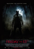
http://www.apple.com/trailers/wb/fridaythe13th
Friday the 13th (the remake)
Additionally, to further my understanding of slasher horror films, I analysed Nightmare on Elm Street in detail.
From my research I also found definitions of slasher horror. Although the definition varies as it depends on who you ask, there are specific traits that links to the genre. Mostly, there is a past involved which is the reason to why the person has become a killer. One thing that separates slasher horrors from thrillers and murder mysteries is the level of violence. Slasher horrors minimise the plot and character development in favour of violence and horror being portrayed. The plots are in fact created by giving the audience the experience of watching the killer's murders. Violent and graphic deaths are valued to hold the audience's interest.

Nightmare on Elm Street
http://trailers.apple.com/trailers/newline/anightmareonelmstreet/
As the trailer begins, the first thing we see is the production logo - 'NEW LINE CINEMA', a Time Warner Company. From the production logo alone, the audience can assume that this trailer will be of the highest standard as Time Warner is an extremely prestigious film company. Whilst creating our own production logo we took these elements into consideration and produced our logo so that it would appear sophisticated and trustworthy to our audience. We also used the convention of having our trailer opening with an image of our production logo; Filmworks.

The establishing shot sets the scene for the trailer. It depicts a deserted wasteland, employing a mid shot of the side of a building. This gave me an idea in thinking that the establishing shot should not show the killer just yet but set the scene so the audience get a feel for how the film will be.
*PICTURE OF MY ESTABLISHING SHOT*

As the trailer continues, it shows a variety of rapid location shots which then introduces a white middle aged man running through these deserted streets. We are then shown an angry mob following him and soon set a house on fire with him inside it. The audience do not know why they are chasing him or why they wish to kill him, creating a sense of enigma for the audience which is already engaging them, in the film, a typical convention of the slasher horror genre. Unlike our teaser, this trailer shows more than one victim and how and when they are murdered. We decided to challenge this convention as we felt that holding back that information from the audience would make them want to find out more. The eerie and childlike music and the use of 'evil children' suggest that the killer is seeking revenge from something that happened to him as a child. However, this sort of music wouldn't apply to my horror, in fact I chose to put a heartbeat going through and change the tempo.
The speed of the trailer, like most slasher horrors is quite rapid and only shows the killer from behind. However we are introduced to his murder weapon; his razor sharp claws.I challenged conventions a bit by shooting some of the shots from the killer's point of view. The trailer ends with a close up of a woman screaming then cuts to the titles, which our covered in blood. I took inspiration from the use of red in the title to signify someone has died in my ending of the trailer which I thought would go well with the title 'Game Over.
A Nightmare On Elm Street Title Ending

Game Over Title Ending

The trailer ends on a shot of Kruger stroking his latest victims face with his claws. He whispers "don't worry about it. This wont hurt one little bit." This is an extremely dramatic ending and leaves the audience desperately wanting to find out more about the movie. I thought about using something like this to conclude the trailer and leave the audience hanging. I then decided to add a dramatic knife falling scene which has a crashing sound as it lands. This scene is saturated in red depicting the bloody death of his victims and leaves you wanting more as it ends abruptly. The Game Over Title then slowly turns Red and looks as if its dripping with blood.
Conventional Slasher Horror Killers
I analysed conventional slasher horror killers before choosing my killer to have a wider understanding of what is required in terms of mise-en-scene and character. After having chosen my killers, I looked over my research to make comparisons to see where I challenge or follow conventions.


Freddie Kruger: A Nightmare on Elm Street.

The protagonist, Kruger is dressed in red, symbolising death and blood. He is wearing a black trilby hat which often covers one eye. His face is scarred and distorted, making him look dehumanised, as an outcast in society. His right hand has blades instead of fingers, making him a unique horror figure. His body language suggests that he enjoys killing people and wants to kill anyone which engages the audience well in a sense that they feel scared.
Michael Myers - Friday 13th

The protagonist Myers is dressed in overalls, stating his occupation before he became the evil protagonist of this movie. His face is completely covered by a mask made from cloth with several tears and rips in it. This suggests to the audience that there is a sense of enigma surrounding this character. He stands tall with a muscular frame to portray his strength and in his right hand he has a butchers knife. His body language in the film with certain shots suggesting overriding resilience and strength and a warped mind is suggested through far gazing.
* They are all masked in some way, showing they are emotionless, the victim cannot put a face to their killer as they are dehumanised. - I challenged conventions by choosing to have a killer without a mask. The killer in my film still believes to be in the game and therefore doesn't feel that a mask is necessary. Although a mask can suggest a nonacceptance for the crimes they commit, my killer is not fully aware of what he is doing as he's turned from being in a virtual world to virtual reality.
* They are all male, highlighting superiority factor that men are more powerful and of a higher status. - I followed this convention by using a male killer. I chose to do so as I wanted stereotypical views to be expressed by my target audience when waiting the teaser trailer which is a very short clip.
* They all have physical deformity which may suggest a traumatic past. I slightly challenged conventions. Although my killer has gone through a traumatic past, it is not shown through his appearance as it didn't physically affect him.
* Unmenacing objects then become menacing objects when seen in the hands of the killer. - I followed this convention as I chose an ordinary kitchen knife which is then portrayed differently when it is seen in association with the killer.
* Choice of weapon suggests a sadistic nature of the killer. - My killer's weapon is a knife. This weapon is seen as more sadistic as he has to get close to the victim in order to kill them making it more personal.
Wednesday, 7 April 2010
Synopsis
After developing my ideas further, I refined my initial plot summary to create a full synopsis. The synopsis tells the reader what happens in the film chronologically however it does not give away twists or surprises that will put them off watching the film.
"Dylan was only 8 when both of his parents passed away having been involved in a fatal car accident. After being put in a care home and then fostered, Dylan was never the same again. The loss of his parents had an extreme effect on Dylan as he chose to not go out or socialise and instead decided to stay at home playing video games all day. Life just seemed hectic with problems at school and outside of his room, within the household. However, what did leave Dylan going was his games console. By the time he reached 18, he had completed every violent game that was out. In the period of 10 years, he built up this anger that he wanted release. The hatred for his parents influenced his decision in wanting to plot murders and his first target being his mum. Due to Dylan’s sadistic mind, he didn’t intend on stopping. He confused reality for the virtual world and began living in a virtual reality."
Before being able to create a synopsis for my film, I had to research into other plot summaries.

Researching existing slasher horror plots helped me in gaining the knowledge of protagonists, stock characters and also typical storylines of slasher horror films. I was then able to use this research and apply it to the plot synopsis of Game Over. I discovered all of the protagonists are villains and male. In every plot summary that I analysed, the protagonist was a violent killer, and seeked to kill teenagers. Stock characters consisted of mostly female teenagers or teenagers who engage in drugs, sex and alcohol.
This influenced me when I created the plot synopsis for Game Over as I adhered to the convention of the protagonist, as our killer is male and also seeks to kill specific targets. Normally, the killer stalks members of the young community, however, this is where I challenged conventions as those who he targets are not your conventional stock characters.
Monday, 5 April 2010
Story Board
-> Final Story Boards <-


I created a storyboard to ensure that on the day of the filming we knew exactly what shots we needed and the locations that they need to be shot in. I found this useful in organising my time well and allowed me to focus on mise-en-scene in the shots and what I require within the frame of the shot.


Subscribe to:
Comments (Atom)
